I’m not here to complain about the new logo. It’s fine. It’s a mean Shark biting a stick, so they kept the spirit of the original. What does concern me, however, are all the rumors that have been going around about the new jerseys making a much bigger deal of something that’s thankfully been a minor part of Sharks history thus far – orange. The Sharks have always had a touch of orange in their logo, and the updated version emphasized it a little bit, which was fine. It’s never been on their jerseys before, and so orange and me got along fine. I was ready to dismiss the rumors about the new orange jersey until I saw pictures of the Sharks players at last weekend’s pacific division tournament:


They’re wearing the old uniforms, but the pants and gloves they’ll use this season. Do you see what I see? Did your heart just sink out of your ass? Yeah, me too. There’s an awful lot of ORANGE on those accessories. So much orange that it would look quite strange if there wasn’t a good amount of it on the new jerseys.
I am anxious. I am nauseous. I am filled with fear and loathing.
Color-wise, the team will still stand out from the pack - just like the dude at the party with the lampshade on his head. If I do something drastic Monday when the team unveils the new jerseys, let this be a record of what drove me to it – the cursed color orange.
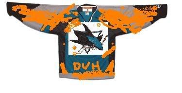
Bonus artist's conception of the new jerseys here!